Fovi Postpartum Coaching
How do we help PEOPLE talk about
their postpartum symptoms?
Fovi Postpartum Coaching App
Duration: 4 weeks
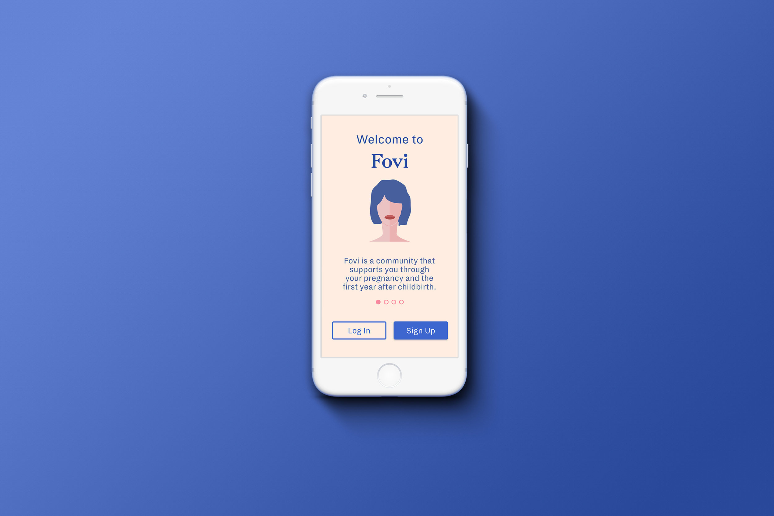
Background
For a 4-week group assignment in my Product Design Studio class, we worked in teams of five with a local client. Our client, Chelsea, is the founder of a text-based postpartum coaching service called Fovi.
Fovi was created to fill the gap of care after delivery. From our first conversation with Chelsea, we learned that there are several common physical and mental conditions that women experience after delivery, however they lack the resources and support. In order to help women diagnose and manage these symptoms, Chelsea introduced Fovi, initially as a text-based service but with the intent of creating a mobile app. As she moves towards a mobile app, Chelsea required help with determining the look and feel of Fovi. The only constraint provided by the client was to avoid exaggerated feminine styles (color, typography, etc.).
Client Expectations
Establish a visual identity for Fovi
Create high-fidelity screens for user testing
assumptions
Platform: Native mobile app (not Apple- or Android-specific)
User: Prenatal and postpartum women in the U.S. with mild to moderate symptoms
“You can think of [pregnancy] like a wrapped candy. Once the candy is out, nobody cares about the wrapper.”
Planning
In order to ensure we delivered the product in time, I developed a project schedule and assigned roles based on each team member’s strengths and preferences. For the product definition phase, we were split into two teams: three members worked together to develop low-fidelity wireframes, while I worked with a team member to create a lightweight design system and develop the copy.
Project Objective
After speaking to Chelsea, we quickly realized her top priority was the on-boarding flow. The on-boarding flow needed to be engaging and trustworthy to encourage users to not only feel comfortable about speaking about sensitive and sometimes awkward topics, but also understand the value of sharing this information. As a result, our guiding question was:
How can we build trust upfront so that users are more honest and forthcoming with their postpartum needs?
User Flow
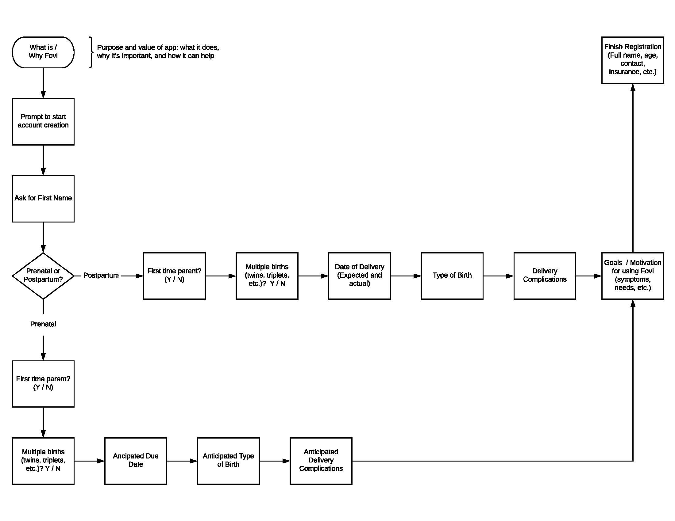
I worked with the team to sketch the typical onboarding flow to help guide the development of wireframes and copy.
Moodboard
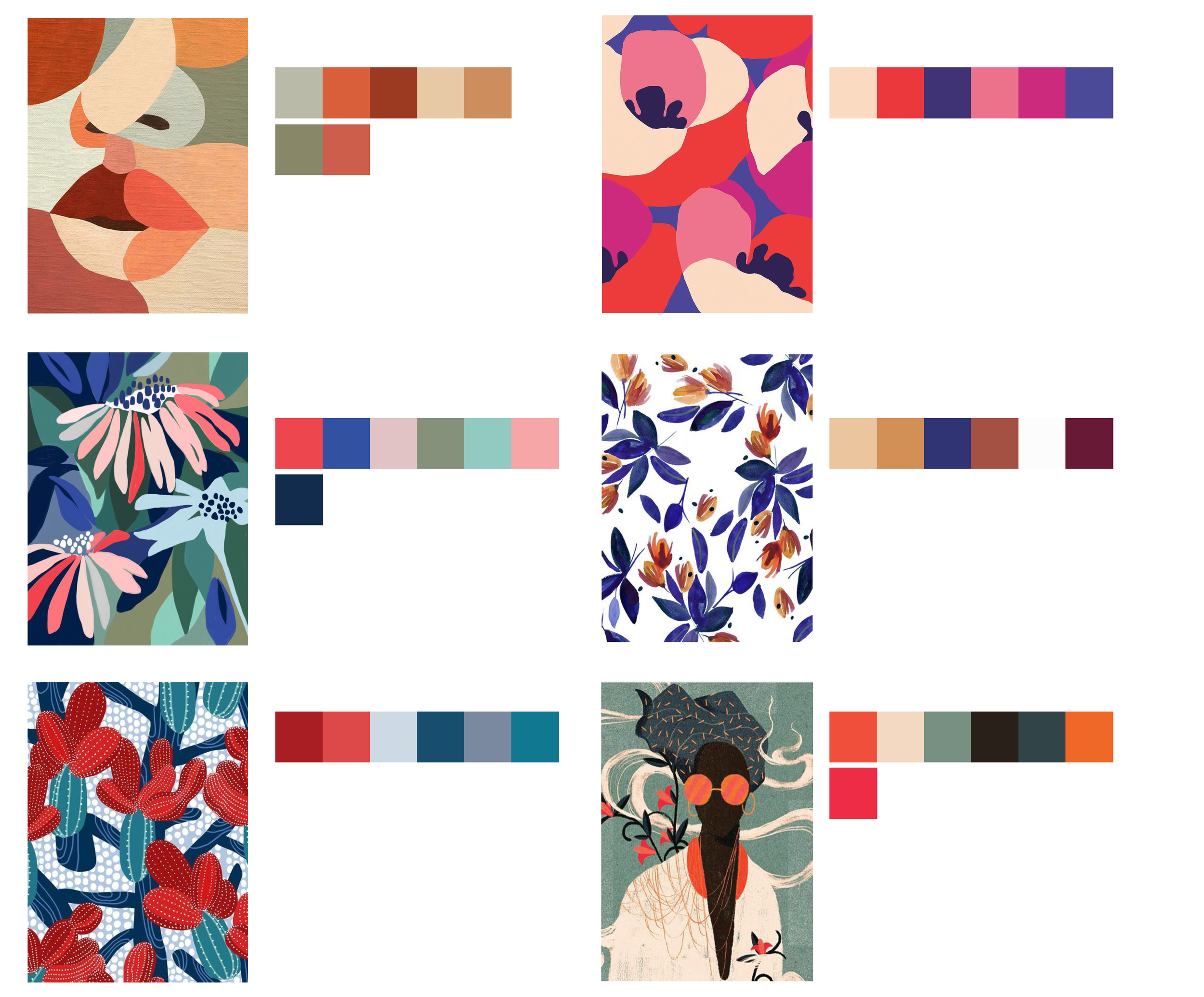
Because Fovi lacked any visual direction — color, illustrations, typography, etc. — our first step in building a design system was to create moodboards for inspiration. The moodboards not only inspired color palettes, but also helped us articulate the brand identity and values of Fovi.
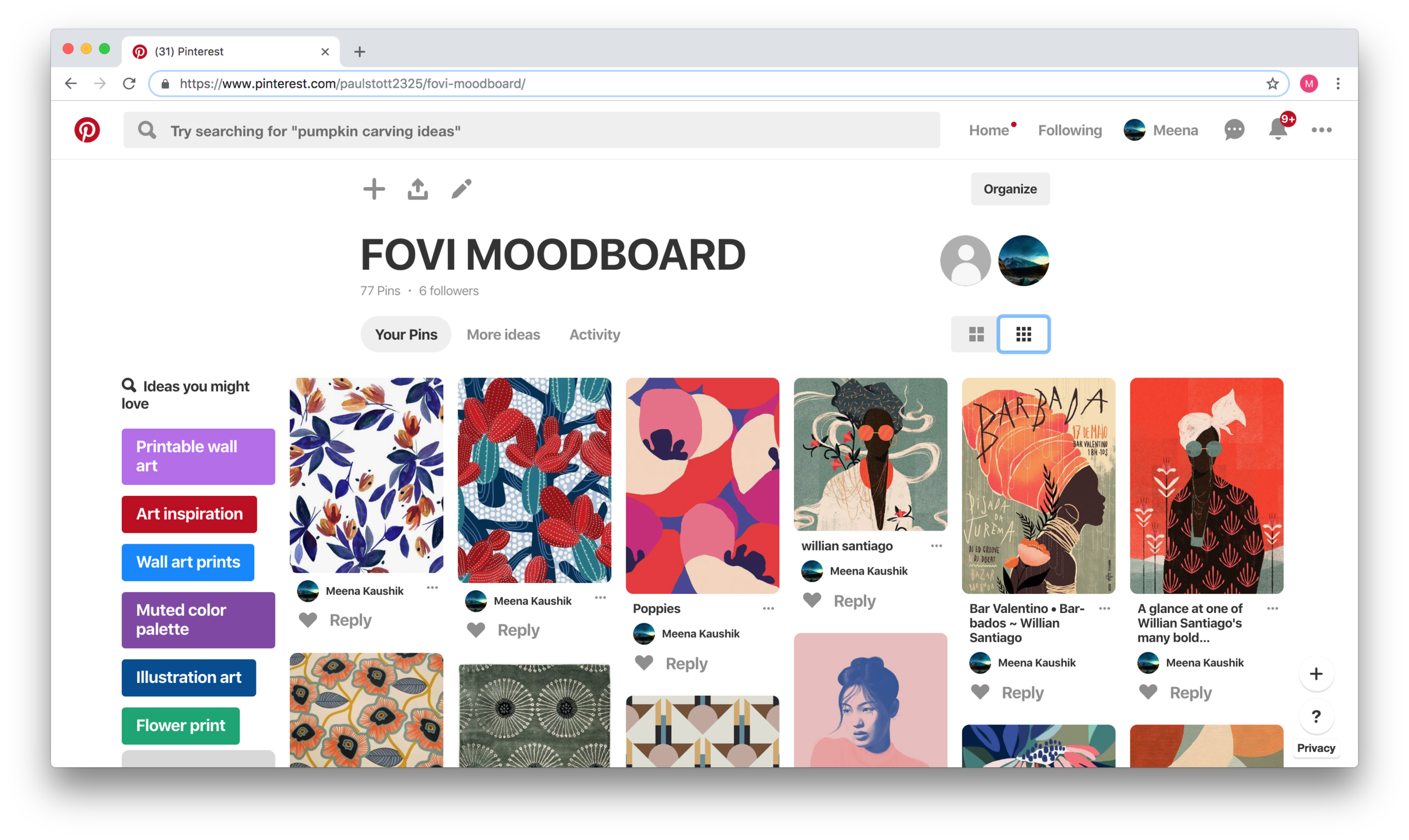
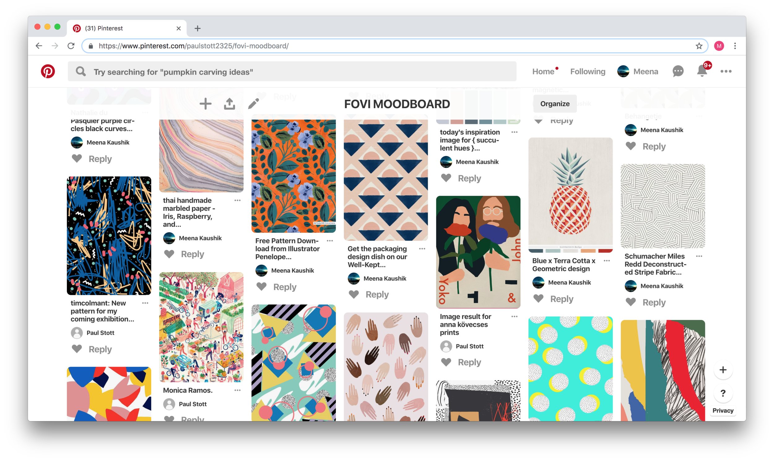
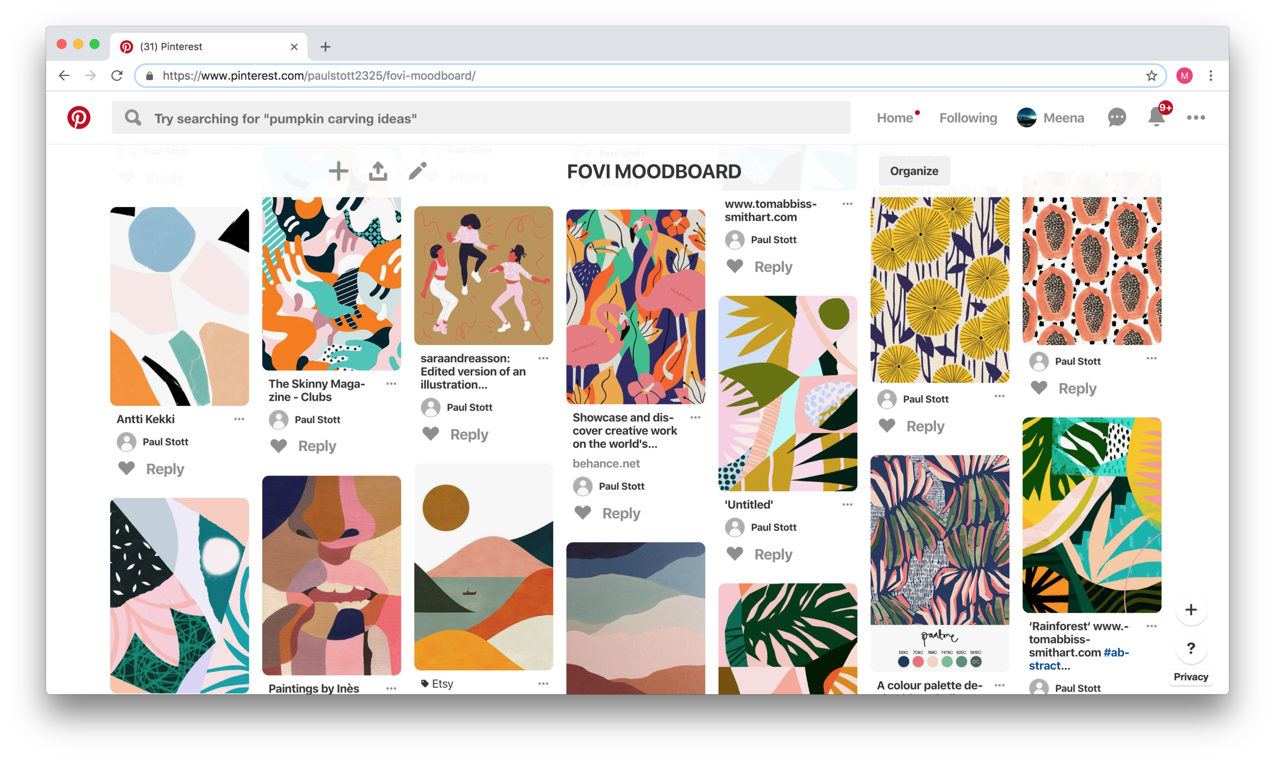
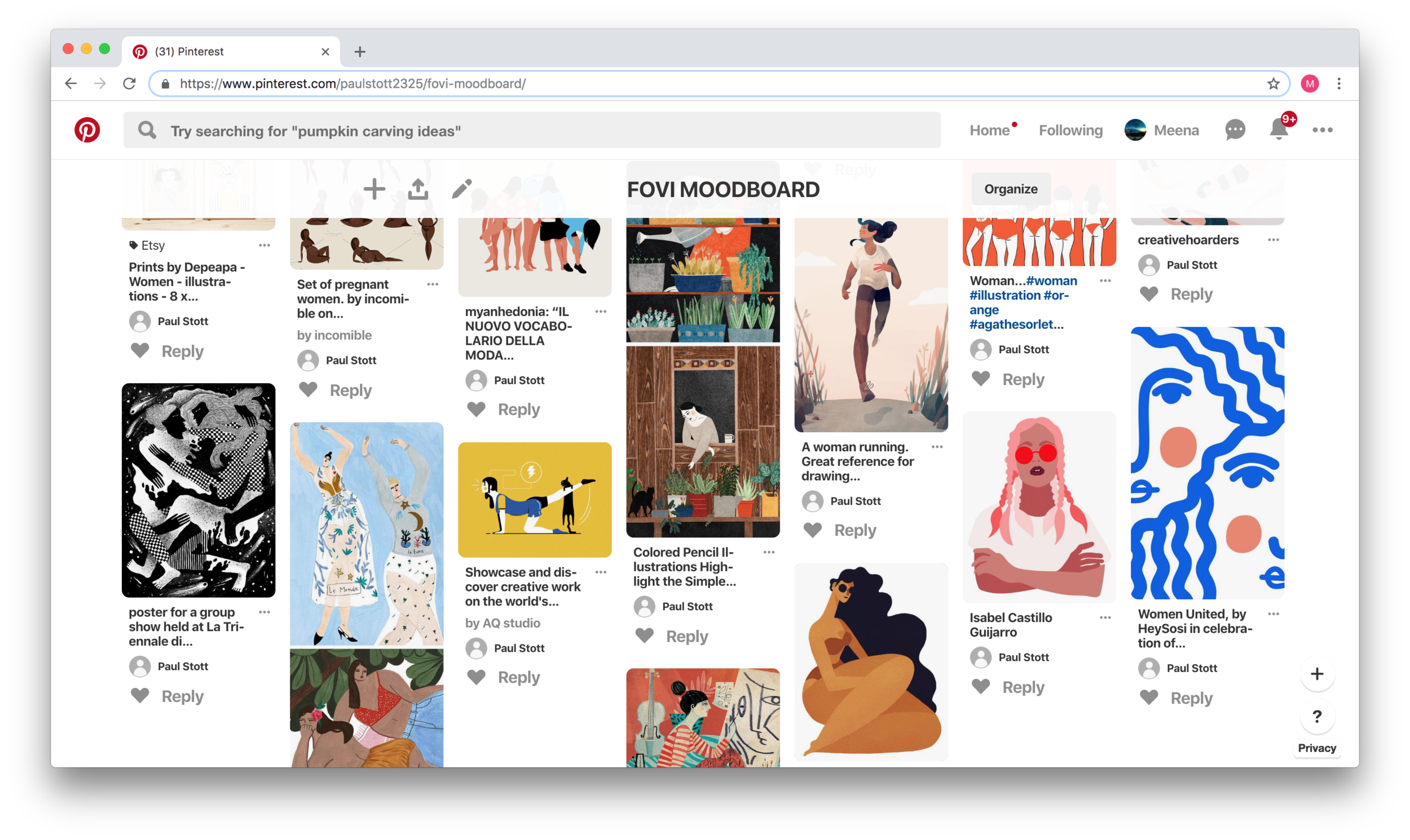


color explorations
Design Themes
Based on an examination of our moodboard and color explorations, we identified four common themes, which we aimed to communicate through our design:
Community
Nature
Beauty
Strength
First Attempts
DeSIGN SYSTEM HYPOTHESIS: CREATE A DARK THEME
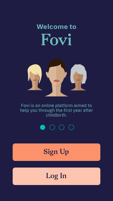
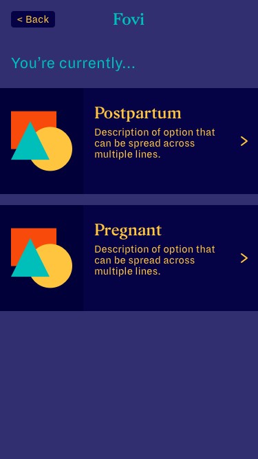
Chelsea indicated that women typically utilized Fovi at night, therefore there is a need to design a mobile platform that limits sleep disruption. Our first instinct was to create a dark theme to be mindful of night-time use.
We created a color style guide based on a dark theme, but to visualize what the theme would look like, we applied it to two main screens: the landing screen, and an on-boarding screen.
Landing Screen
Form
However…
While we thought we had effectively solved the need for a night-mode as well as a not-overly-female color scheme, we learned that the screens failed to communicate a sense of comfort and warmth. We also realized that we over-emphasized the need for a night-mode, because most women would not be on-boarding in the middle of the night, and in service of avoiding stereotypically feminine colors, we failed to indicate this was a women’s health app.
With all of these insights in mind, we were back to the drawing board to create a new design system that better communicated our core values.
wireframe hypothesis: ask all questions upfront
Fovi’s core value is in its personalized symptom tracking, coaching, and exercises, which requires users to provide information upfront about their prenatal and postpartum experiences. Our first wireframes asked all the required questions upfront, so that the users would see a personalized dashboard after completing the on-boarding process.

Wireframes created using InVision’s Freehand
However…
We learned that by asking all of the questions upfront, we increased friction and risk that the user would abandon the process. As a result, we decided to change the user flow to begin with the basic profile information (name and email), and then give the user the option to continue the on-boarding process or jump into the app itself.
Final Deliverables
Lightweight Design System
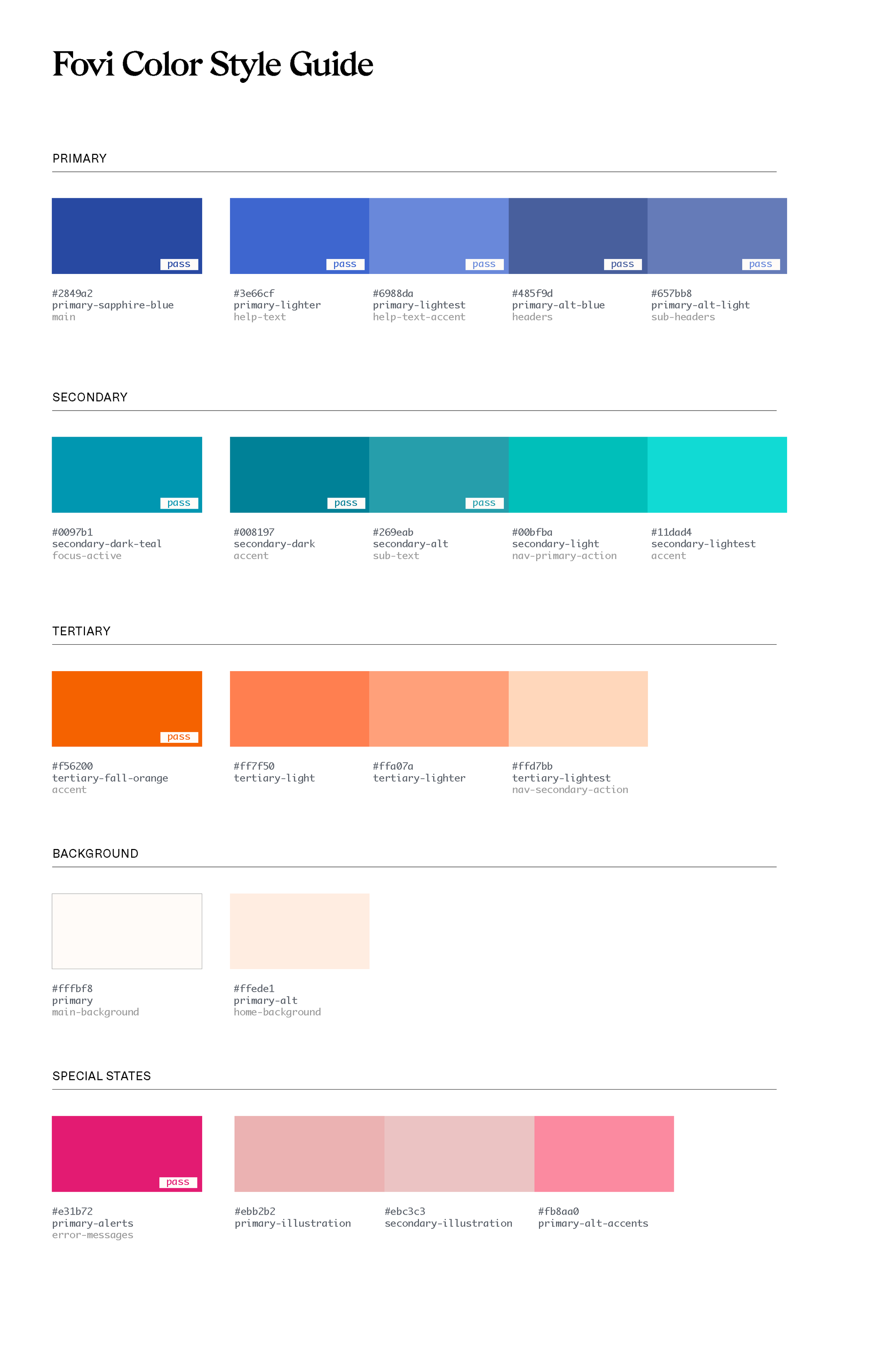
I spearheaded the rebuild of the design system while my teammate worked on the copy and fine-tuned symbols. Based on the input we received from classmates, the client, and our instructor, we chose to move forward with a light theme, to better convey calmness and support.
High-Fidelity Mock-ups
Based on the wireframe, we divided the screens. I was responsible for the introductory screens including: landing, value propositions, name input, and user type.
In total we created over 70 screens to indicate the difference in copy based on user type (prenatal or postpartum), highlight error states, and illustrate various states (e.g., default, active, complete).
To maximize compatibility with Web, Android, and iOS, our instructor recommended that we design for an iPhone 8.

Landing Screen
The Introduction
We wanted to communicate the purpose and value of Fovi upfront to encourage users to sign up. We chose to present this information in a more approachable and engaging way by placing each value proposition on a different screen.
“I love how calming, soothing, and sophisticated the visual design is, especially because most women don’t feel sophisticated after giving birth.”
Value Proposition 1
Value Proposition 2
Value Proposition 3
“You absolutely met the client’s needs, and gave her a solid start to a tricky problem. I liked seeing how you grappled with some of the core issues around trust, and I think the final flow, while simple, shows a great deal of thoughtfulness. The screen design was clear and clean and the attention to detail on copy was effective.”
The Form
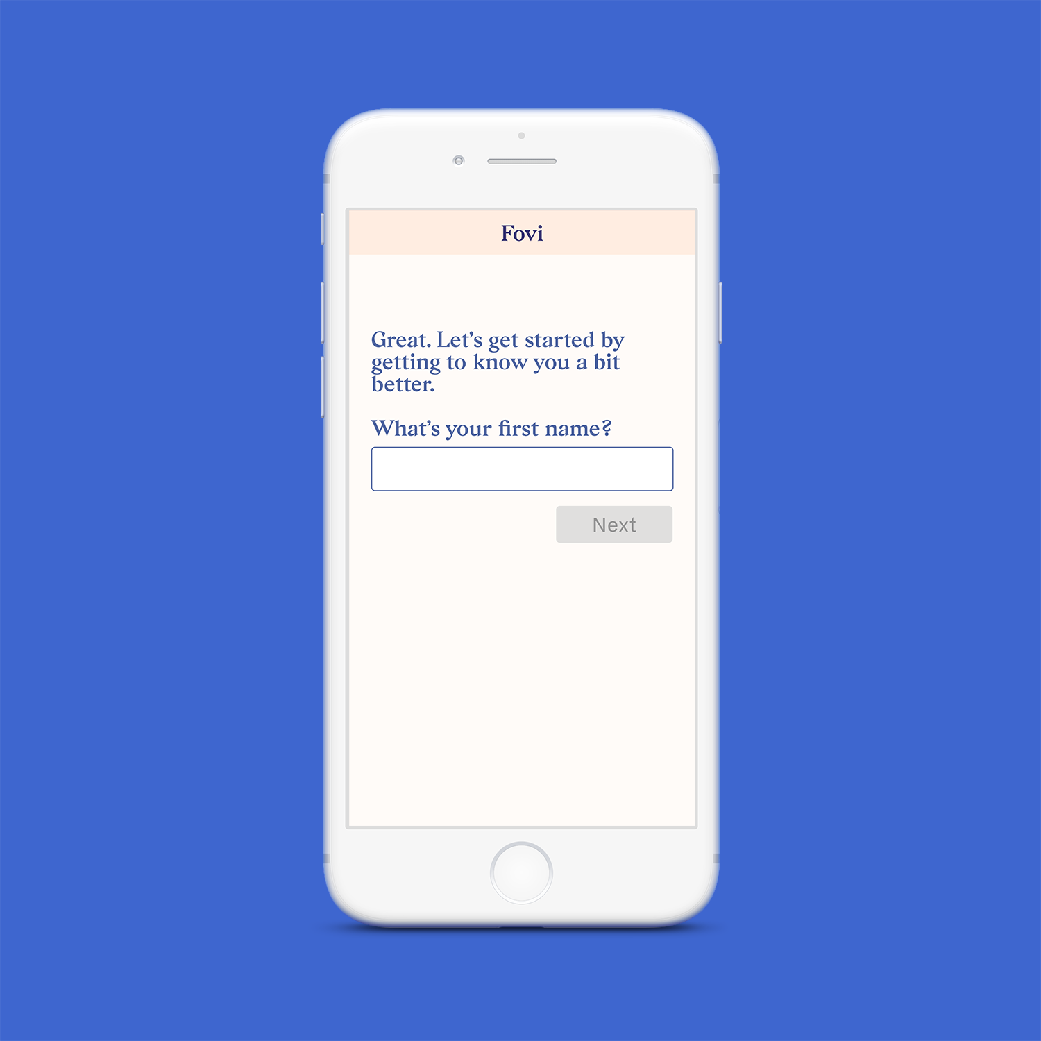
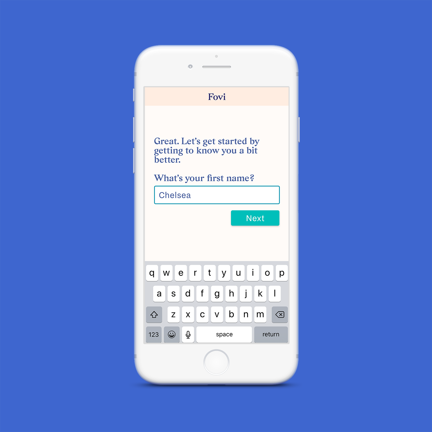
Each screen on the on-boarding flow features a casual, personal, and conversational tone to maintain the human touch that is present in Fovi’s current text-based service. We also felt this tone, along with frequent messages of encouragement, would further alleviate any concerns or hesitations, and create a safe space for users to provide honest information about their prenatal and postpartum experiences.
We originally had a laundry list of questions that our client wanted to know upfront, but we worked with her to separate the items into must-haves and nice-to-haves. Our final design gathers the information needed to construct a personalized dashboard (the must-haves), with the hypothesis that once the user sees the value of their input, they would be more inclined to provide the nice-to-have information. Upon client request, we included a few nice-to-have questions in the onboarding flow, however these questions also included a “Skip” option to reduce any friction. The form also dynamically adjusts based on the user’s responses to avoid questions that do not apply to the user.
Form > Name > Default
Form > Name > Complete
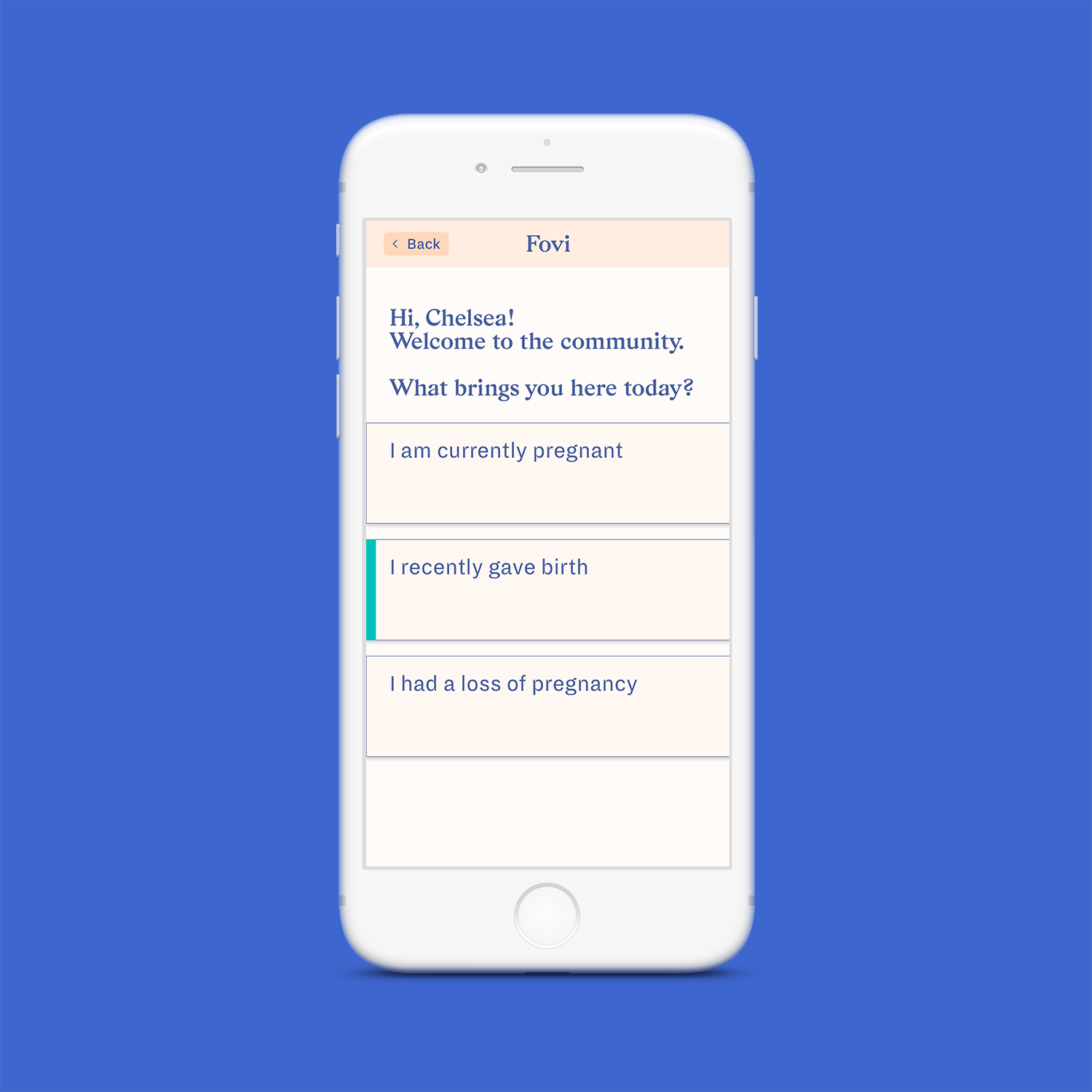
Form > User Type > Active
NORMALIZING EXPERIENCES
Rather than concealing sensitive responses, such as loss of pregnancy, we wanted to list it alongside the other options to indicate that it is not something users need to hide or should be ashamed of.
Form > General Health Survey
For the Other Condition option, we opted to list it as a checkbox rather than a text field because the client indicated upfront she only needed to know if the user has a condition. Additional detail of the condition could be collected later in the user flow.
Form > Breastfeeding > Expanded Information
We included an accordion on questions that were more likely to be perceived as unnecessary and/or uncomfortable to demonstrate the rationale for the question. By increasing transparency, we can build trust and encourage users to provide an answer rather than skipping the question.
“You did a great job grappling with the tension between collecting
as much useful information as possible while also reducing friction
and making it quick and easy to get going.”
Reflection
As we were defining the project plan, I was excited to include and be a part of the development of a design system because it allowed me to dive into the world of color, typography, UI components, grids, and more. It also effectively facilitated the process of working with a group of designers by ensuring consistency and alignment.
One of the biggest realizations of this project is the critical role of visual design. I was unaware of how powerful a change of theme (dark to light) can be for the overall perception of and experience with the product. When shaping the visual design, we had the brilliant challenge of not only establishing the product as a reliable health service but also creating a calm and soothing space to openly talk about sensitive topics. While I feel we made great progress on the visual design throughout the course of the project, I feel it has not quite hit the target, and so I am curious to continue exploring other styles.
Lastly, I strongly emphasize the need for feedback throughout the process — from defining the design system through high-fidelity mockups. The feedback provided by my classmates, client, and instructor was valuable, but it would have been more beneficial to talk to prenatal and postpartum women especially given the sensitivity of this topic.