HOW CAN WE help people find information
about prominent pieces of art?
Museum Design Challenge
Duration: 4 hours
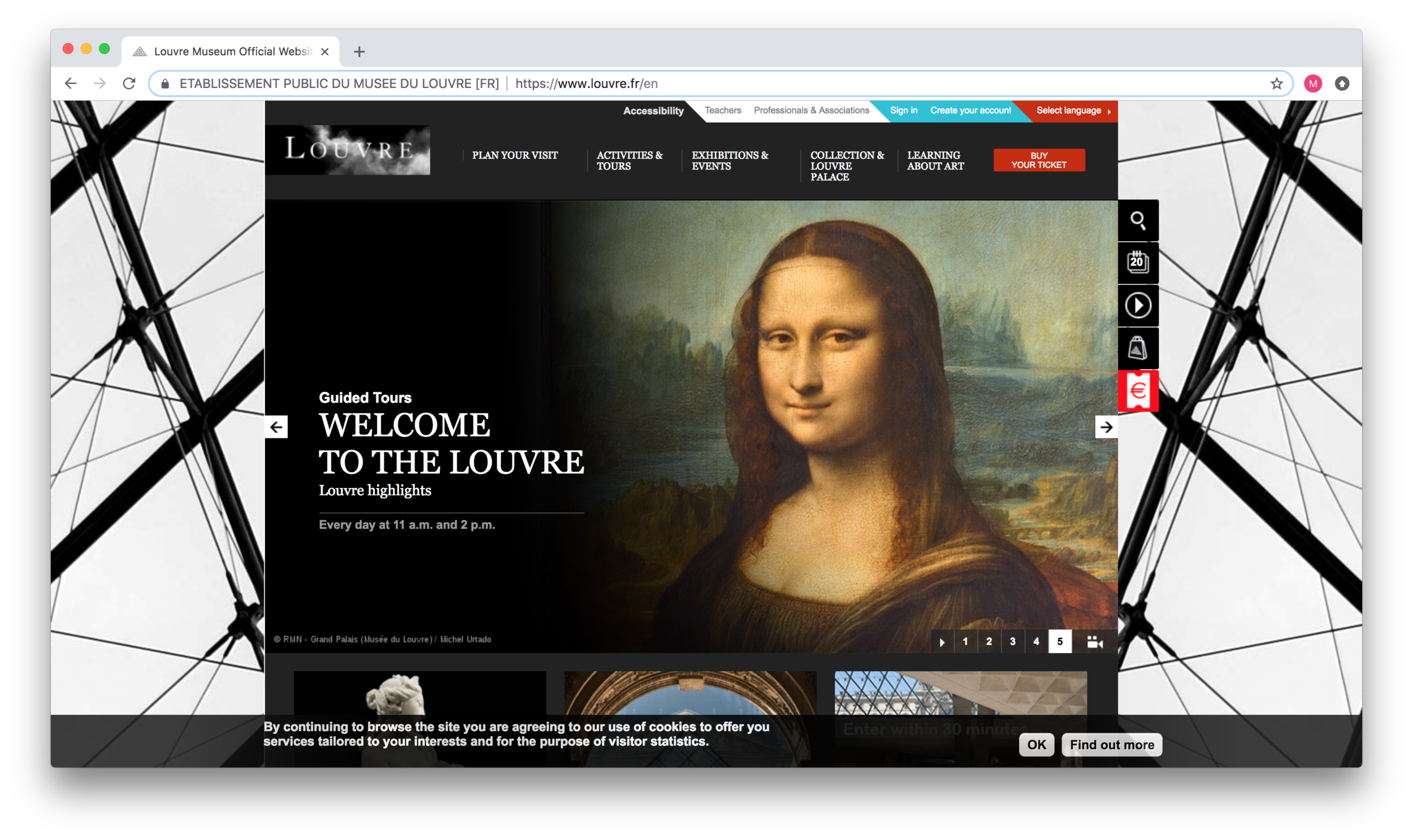
Current Louvre Landing Page
The Problem
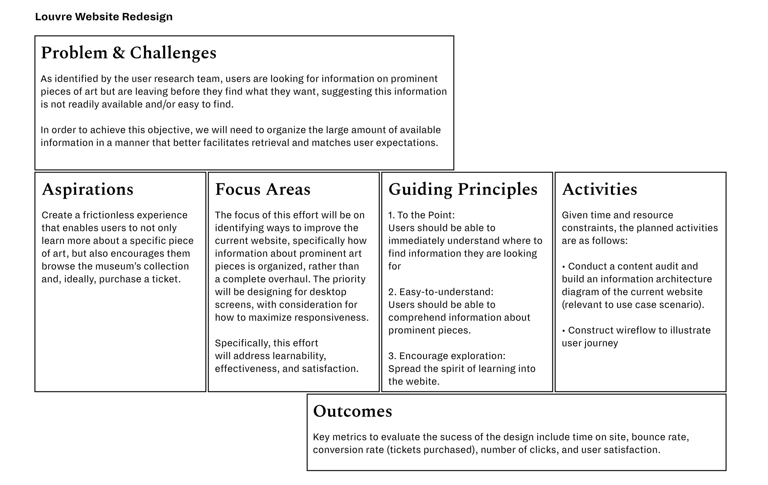
To begin, I filled out a UX Strategy Blueprint to scope the work based on the time constraint (4 hours), identified problem, and target outcomes.
Assumptions
The primary users of the website are people with an interest in art and/or potential museum visitors
One of the key reasons why users visit the Louvre website is to gain information about prominent pieces of art
Users seek information about prominent pieces of art before their visit, therefore they are most likely viewing the content on a desktop screen at home, work, or a third place (e.g., cafe, library, etc.)
Users consider information about prominent pieces of art when determining whether or not to purchase a ticket
In addition to finding information about a specific piece of art, users can benefit from exploring other prominent pieces
“Prominent pieces” are defined as those that are highly regarded by the art community (i.e., masterpieces)
The information users are seeking in regard to prominent pieces include: name of piece, artist, year, geographic origin, and brief description.
Target Users

Art lover
The art lover has some knowledge of art and is curious about a specific piece or category. Before going to museums, they prefer to do some research to ensure certain pieces are featured and to learn about the details of these pieces.
As an art lover, I want to read about key art pieces or collections before I visit so that I can ask questions and make my own interpretations when I am at the museum.

Art Explorer
The art explorer enjoys visiting museums and does not have a specific art piece or art category (e.g., painting, sculpture, etc.) in mind. When they visit museums, they want to make sure they view all of the “must-see” pieces, and prefer knowing a high-level description of the piece.
As an art explorer, I want a list of the art pieces I should see
at the museum so that I can make sure it was worth my time and money.
Information Architecture
For the information architecture diagram I focused on the primary navigation, and more specifically, the areas wherein information related to prominent art pieces were stored. From my survey, most relevant information was featured under Collections & Louvre Palace. Within this sub-menu, the relevant items include: Curatorial Departments, Search the Collection, and Selected Works. On the Selected Works page, items are grouped into twenty-nine categories including Masterpieces and The French Revolution.

Content Audit
I conducted a partial content inventory which included the landing page as well as pages relating to prominent art pieces to get more detail about the content structure and identify which content can be reused, needs a refresh, and should be removed entirely. For this inventory, I focused on the main navigation bar which is featured directly above the slideshow.
From the content audit, I identified several redundancies wherein the same information was listed in several parts of the main menu and a lack of clear hierarchy and calls to action.
User Flows
I identified the following paths within the current design that users can take to retrieve information about prominent art pieces.
( 1 ) Collection & Louvre Palace > Selected Works > Masterpieces > Aphrodite, known as the “Venus de Milo”
( 2 ) Collection & Louvre Palace > Curatorial Departments > Paintings (shows collage of paintings; detail about the name and artist of the piece are revealed upon mouse-over)
( 3 ) Collection & Louvre Palace > Search the Collection > Enter search term “Mona” > Mona Lisa
Use-Case Scenarios
Before diving into sketches and wireframes, I wanted to synthesize the information I collected and contextualize it within the user’s experience. In order to do this, I generated use-case scenarios for the wireframes through storyboarding to explore how users would interact with the product as well as their expectations.
Art Lover
Art Explorer
Wireframes
In addition to the work above, I conducted a brief survey of other museum sites to understand (1) how they organize information and (2) what terminology they use. I chose to design the main screens that are part of the user’s journey of finding information about prominent art pieces—landing, search, browse, and details of an art piece—while leveraging the existing content and structure.
I constructed medium fidelity wireframes to focus on the layout and content.
Landing Screen
For the landing, I prioritized information regarding prominent pieces of art: collection of masterpieces, highlighted pieces of art, featured exhibitions, search bar, and ticket purchase. I created four versions of the landing screen, each of which centered on a different theme but shared a common value of simplicity and minimalism. Ideally, I would work with the larger internal team and/or users to hone in on what works and what does not work.
Landing v1: A Little Bit of Everything
1 / A Little Bit of Everything
In this design, I employed a magazine-style layout to display key information: search bar, artwork of the day, collection of masterpieces, announcements, and exhibitions in an easy-to-digest way. I split the navigation into primary and secondary (items in each of these menus should be confirmed through research), and bucketed the remaining items in a hamburger menu at the bottom of the screen.
Note: The large blocks would be replaced with relevant images of the art work
Landing v2: To the Point
2 / To the Point
With the assumption that most users are visiting the site to either learn more about the museum or plan their tip, I highlighted two clear calls to action: Learn and Visit, to minimize the amount of information and possible actions presented upfront to users.
The search bar is still visible, and the rest of the items are located in the menu.
Landing v3: Simple and Elegant
3 / SIMPLE AND ELEGANT
One of the Louvre’s most distinguishing and iconic features is the Louvre Pyramid, a glass and metal pyramid surrounded by three smaller pyramids in the main courtyard of the palace. In this design, I chose to utilize this image to create a sense of familiarity and wonderment. To reduce the amount of information presented upfront, I listed a few key menu items, organized the remaining items in a hamburger menu at the bottom, and maintained the visibility of the search bar and buy ticket call to action.
Landing v4: Catch Your Eye
4 / CATCH YOUR EYE
This design is similar to the first, in the sense that it employs a magazine-style mosaic layout. Compared to the first design, this one uses larger visuals that are shown closer together to increase attractiveness and engage users. This layout is intended to encourage users to browse information about the museum, including selected works, artwork of the day, current exhibitions, and announcements.
There is also a menu at the top that serves as an accelerator for users who are seeking specific information.
Note: Layout 1 is used to show the following screens. It was chosen because I felt it was the most effective in leading the user’s eye and telling a story.
Search
If the user selects “Search” the bar will extend and fill the entire screen to enable real-time filtering of results. There is potential to include auto-complete and/or suggestions to further support the search process.
Users can also filter the results based on various criteria, such as artwork, artist, and department. A future iteration may also include a sorting option so that users can sort by alphabet, relevance, date, etc.
The results are shown in a card-based layout that displays key information: image, title, categorization (e.g., painting, print, online tour), and artist (if applicable).
Search: Default
Search: Expanded Menu
Search: Active
Search: Filtered Results
Browse
If a user prefers to browse artwork, they can easily access the collection through the “Art + Artists” tab. On this page, there is a description of the collection followed by an option to search. Users can also choose to browse by various categories including Selected Works and Curatorial Departments (as featured on the Louvre’s current website).
Future iterations may consider other ways to facilitate browsing such as by artist, time period, or geographic origin.
Browse: Default
Art Piece Details
Compared to the current four-step process to view details of a piece, users can access this information directly through a search bar or from browsing through a category. On this page, the primary focus is on key information about the piece: image, name, artist, time period, and viewing location. There is also breadcrumbs to help users navigate and an “Add to List” option. The “Add to List” option is an opportunity to enable users to create itineraries, which may support ticket sales and user satisfaction.
Logistical information about the piece (curatorial department, material, measurements, and author of the description) are provided next to an overview of the piece. Further details are shown below in accordians for progressive disclosure.
Details of Art Piece: Default
Reflection
Ideal ingredients
If given an opportunity to re-do this exercise, here are some elements I would like to include in the definition phase:
Site analytics to identify what works well, what does not work, and key drop off points. I would also include a round of usability testing to gain insight as to where users get stuck (bottlenecks, areas of confusion, misinterpretation, etc.), what is the common track users take when searching for prominent art pieces, and what query terms they use.
Interview key stakeholders involved in the redesign to understand their priorities and objectives, as well as any problem areas they have identified.
Review brand attributes and guideline documentation to identify the boundaries of the visual style, feel, and tone of the redesign, and determine if there is any flexibility with these boundaries.
Work with the user research team to articulate user types (needs, values, behaviors, contexts, etc.) and define “prominent pieces of art”
Audit other museums’ websites as well as analogous spaces, such as fashion retail and libraries
For the execution phase, I would have liked to collaborate with the team to ensure the use-case scenarios are grounded in user insights and to define the hierarchy of information. I also would have, of course, enjoyed a longer ideation session upfront to explore different ways to address problem areas and elevate the overall experience.
NEXT STEPS
Develop more screens to build out a full user flow
Test screens with users to evaluate current direction and prioritize product features
Ensure designs meet web accessibility standards
Evaluate responsiveness of design and consider a mobile-first approach