R+R: Name Learning Platform
how can we make learning names
easy, effective, and enjoyable?
R+R Name Learning Platform
Duration: 4 weeks

Background
At the beginning of the semester, one of my roommates started his role as a GSI (Graduate Student Instructor), UC Berkeley’s equivalent of a Teaching Assistant. He had a photo roster – a sheet of paper with his students’ names and photos – and asked if I could quiz him on it so that he could learn names as soon as possible. He told me he had 60 students split between two sections, and wanted to be able to call students by name in order to effectively moderate in-class discussions.
When I found out that I would be able to pursue a project of my choice for my final Product Design Studio assignment, I jumped at the opportunity to dive back into my Cognitive Science roots and turn that activity into a name-learning app.
PERSONAL GOALS
Responsive Design: Gain experience designing for both mobile and desktop
Rapid Iteration: Conduct at least 2 rounds of user testing
Interactive Mockups: Create gifs to showcase user interactions
“A person’s name is to that person
the sweetest and most important sound in any language.”
The Process
The Problem
Names are important, but hard to remember.
Faces, however, are comparatively easier to remember, hence the common experience of recognizing a familiar face but being unable to recall the person’s name. A person’s name is the greatest connection to their own identity and individuality — using a person’s name can make the atmosphere noticeably friendlier and more relaxed, which is especially critical in work and school environments.
So how can we strengthen the link between names and faces to facilitate seamless interactions in the office and in the classroom?
Target Users

NEW EMPLOYEE
Employees who are new to a small- or mid-size
organization (20-60 people) and interact
frequently with multiple team members

GRADUATE STUDENT INSTRUCTOR
Graduate Student Instructors / Teaching Assistants
who lead discussion sections outside of lecture
for more than twenty college students
Foundational Research: What do users need?
To begin, I needed to understand how and why people learn names. My game plan was as follows:
Review literature discussing cognitive mechanisms underlying the process of learning names as well as best practices
Survey users’ current techniques, needs, and frustrations through one-on-one semi-structured interviews with Graduate Student Instructors / Teaching Assistants and employees
KEY INSIGHTS
The learning process:

ENCODING
The initial experience of perceiving
and learning information

STORING
Consolidating, organizing, and
maintaining the information

RETRIEVING
Accessing the stored information
when needed
Associations and cues are useful. Many name-learning tips and tricks rely on the creation of associations, typically between a name and a fictitious image. Two successful ways to use associations for recalling names include creating outrageous or striking imagery or constructing meaningful, distinctive cues that provide reminders of the original experience.
Names are abstract, making them difficult to remember. There is a part of the brain dedicated to recognizing faces called the Fusiform Face Area, which is positioned in the part of the brain called the Temporal Lobe. There is not, however, a corresponding brain region for remembering names. Instead, there are brain regions dedicated to remembering words – and names can be considered special examples of words. Faces are incredibly informative — expressions, features, etc. — while names are, at the highest level, a couple words, a sequence of arbitrary syllables that you learn to associate with a person. Therefore, the ability to place faces and names refers to two different psychological processes: recognition (“Is this person familiar, yes or no?”) and recall (“If yes, what is their name?).
Practice makes perfect. In order to pass a piece information, such as a name, from short-term to long-term memory, it needs to be actively repeated and rehearsed. Once it is in long-term memory, the more meaningful and linked to other information it is, the easier it is to retrieve.
Incremental learning. Most users practiced names — through review of a class roster or company website — for short periods of time during their day, such as before class or during a commute, or until they achieved their goal (e.g., learning 5 names or practicing for 10 minutes). Few were interested in and/or able to sit down for longer periods of time to learn names.
Keep it professional. Both employees and graduate student instructors / teaching assistants expressed a lack of interest in learning personal details about their coworkers and students. Employees felt personal details are not communicated well through writing (for example on company websites) and prefer to learn this information through face-to-face interactions. Graduate Student Instructors / Teaching Assistants are often around the same age as their students, and emphasized the need to establish themselves as instructors rather than peers. As a result, they stressed the importance of keeping interactions with their students focused on class-related or academic topics rather than personal interests.
Minimum of 3 weeks. The average time for users to learn the names of all their students or co-workers ranged from 3 weeks to 3 months. Some mentioned that if they haven’t asked for a person’s name after a few weeks of meeting them, or they can’t remember a person’s name, they would likely avoid directly interacting with them, therefore establishing a need for learning and retaining names as soon as they can.
“A name is simple, but it has a lot of weight.
It’s odd if someone doesn’t know your name because it makes you think
’why don’t you care enough about me to know my name?’”
Design Principles
Based on the research findings, I defined three primary design principles to serve as guidance for the ideation process as well as criteria for a successful solution.

MAKE IT APPROACHABLE
Create bite-sized learning activities to
accommodate busy schedules, acknowledge progress and motivate users

MAKE IT EFFECTIVE
Understand cognitive mechanisms and
leverage established learning methods
to create effective tools

MAKE IT FUN
Explore inventive and engaging
activities to make learning names
an enjoyable experience
User Flow Diagram

Design Round #1: What do users want?
LOW-FIDELITY PROTOTYPES
To determine the product features, I generated low-fidelity prototypes and asked users to think aloud as they navigated through the app.

User Feedback Highlights

Grid over list view
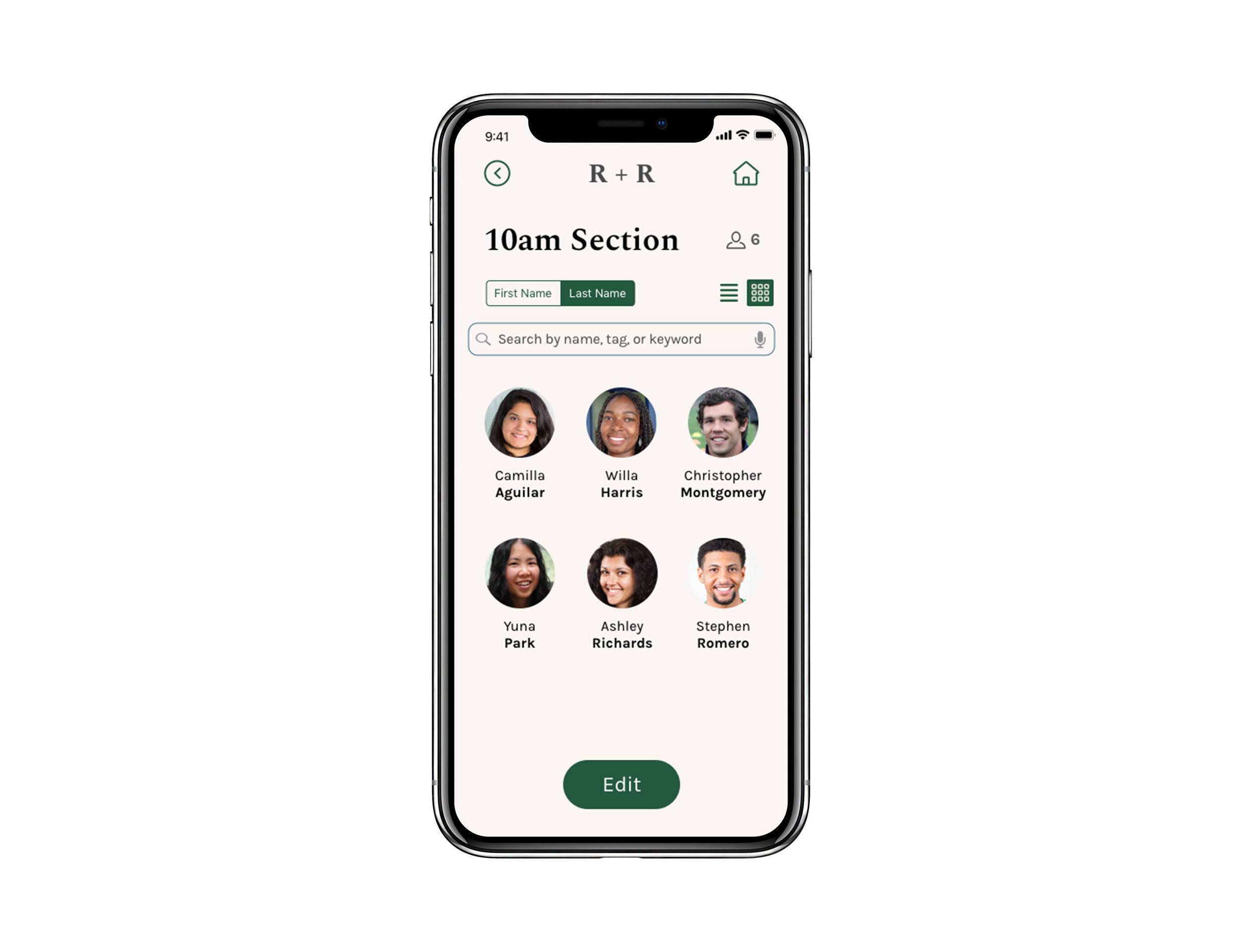
Most users preferred to see their dashboard as a grid rather than a list because of the difference in photo size. The grid allowed for larger photos, which users felt would better aid scanning than a list, confirming the ease of recognition over recall.
Some users, however, preferred to see the dashboard as a list view, which resembled a traditional roster.

LITTLE VICTORIES
Most users were overwhelmed by the amount of choices presented on this screen, especially considering this activity was the first in the series. Some commented that there should be less options to increase the likelihood that the user gets the answer right, thereby increasing their confidence and motivating them to continue. Additionally, less options allows for larger photos.

BUILD A BRIDGE
Users felt that learning details of their co-workers or students is helpful, however, this style prompted more memorization than association. Users were more focused on filling the blanks rather than connecting the details with the name and photo to use them as retrieval cues.
Design Round #2: Can users complete tasks? Is the design successful?
Based on the user feedback, I refined the prototype and created high-fidelity mockups. In order to test the usability of the screens and ensure the design successfully addressed user needs, I went back to users and employed a guerrilla user testing and cognitive walkthrough technique.
User Feedback Highlights


“What’s a group?”
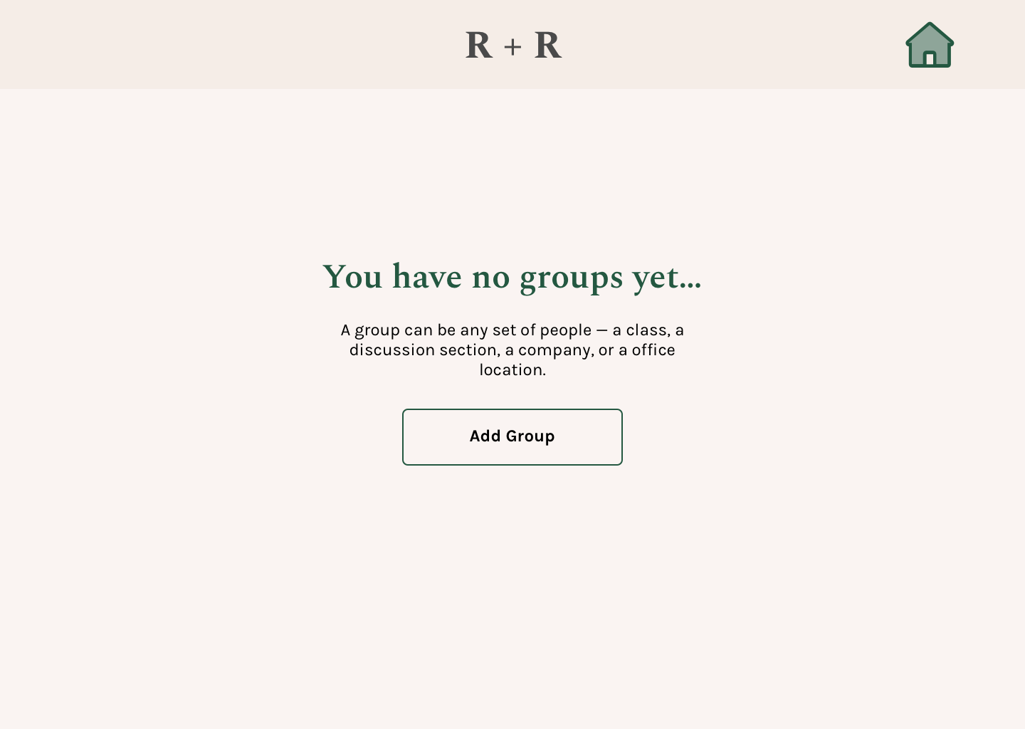
In the low-fidelity prototypes, I included a brief instruction for creating a group, however users felt it was too constraining. For the next iteration, I opted out of including support text, and found that almost all users were unsure what a “group” referred to. This screen in particular exposed the importance of UX writing, and posed a question for me as to how I can clarify the term without imposing unnecessary limitations.
“WHAT DO YOU MEAN BY DEFAULT?”
From the first round of user testing, users were curious how the app included the pronunciation of names for one of the activities. So, I included a space in the "Add Person” page to indicate that the app would either use a default pronunciation or enable the user to record their own. Users, however, were confused as to (1) why this information was necessary, (2) what ‘default’ meant, and (3) how to shift between the two options, prompting a need to re-think how this information is presented.

“How do I view the group?”
For the dashboard, I featured two primary actions per group: Quiz and Practice. I also included an option for users to review all their groups together and to edit each group. Users, however, did not feel a need to review groups together, and assumed the edit icon would be for editing the name of the group rather than viewing its contents. Users also asked to see an at-a-glance indication of their progress in each group, resulting in a need to reconfigure the page to better align with user expectations and needs.
Final Design
Lightweight Design System
To facilitate the rapid iteration process, I created a lightweight design system. I chose a warm, earthy background color and paired it with vibrant shades of green and orange, to create a welcoming and energetic learning space. I also tested the text colors against the background to ensure they were AAA-rated.
HIGH-FIDELITY MOCKUPS
Onboarding Flow
Onboarding
Account & Group Creation
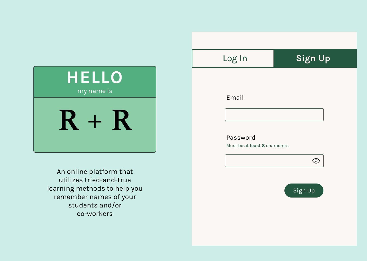
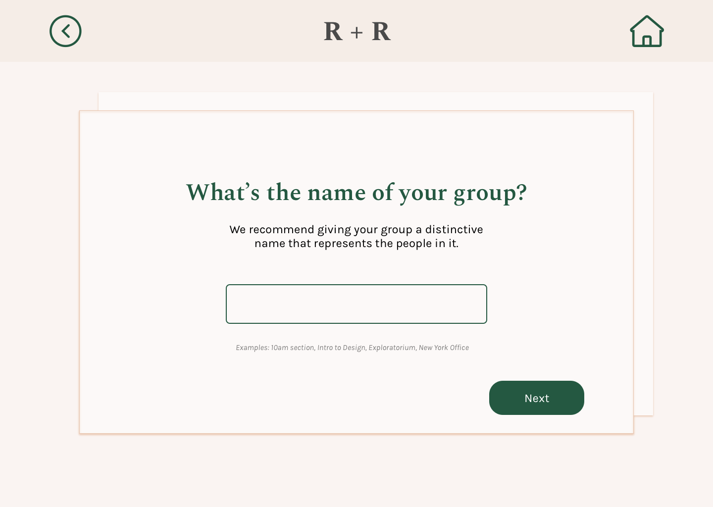
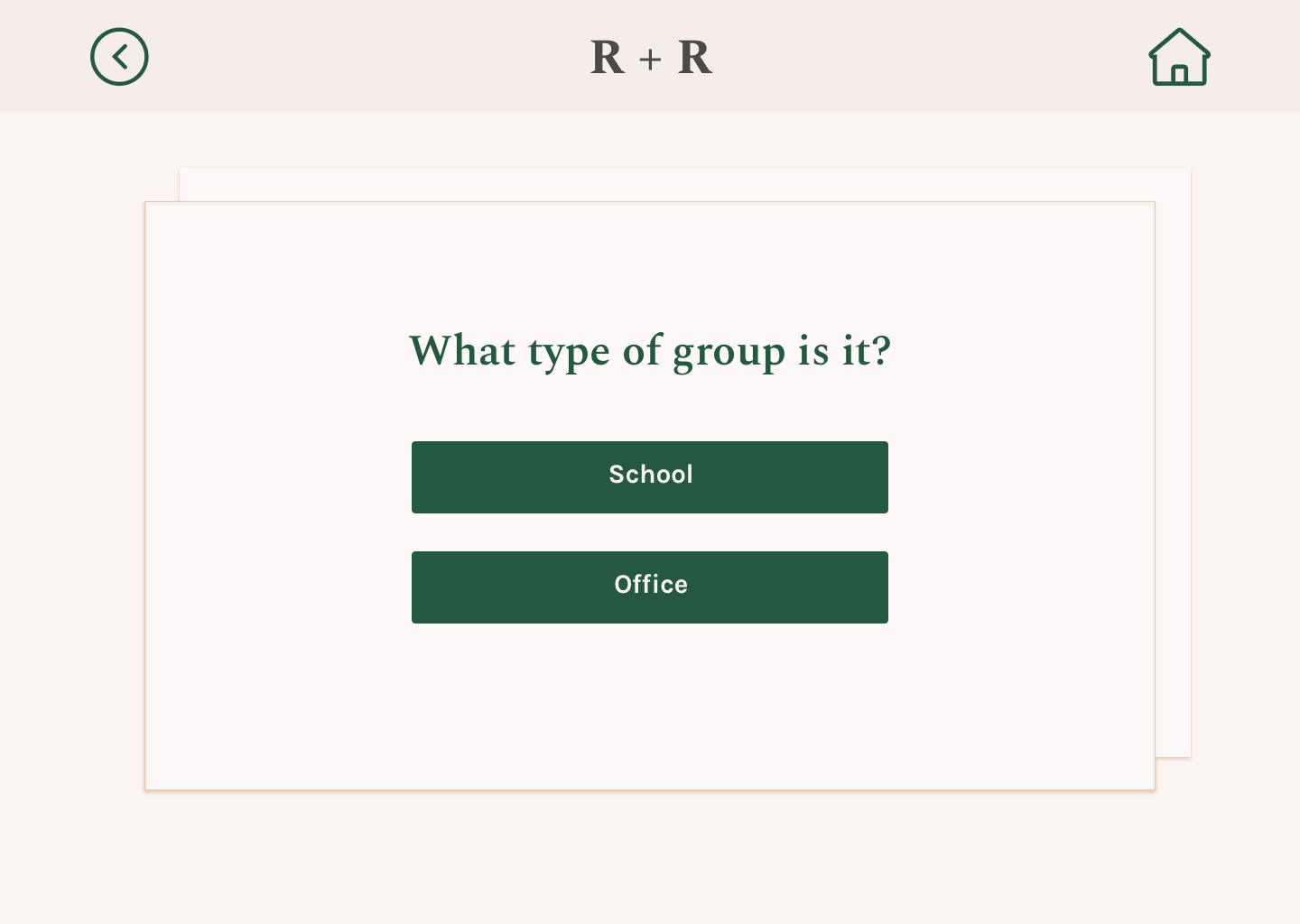
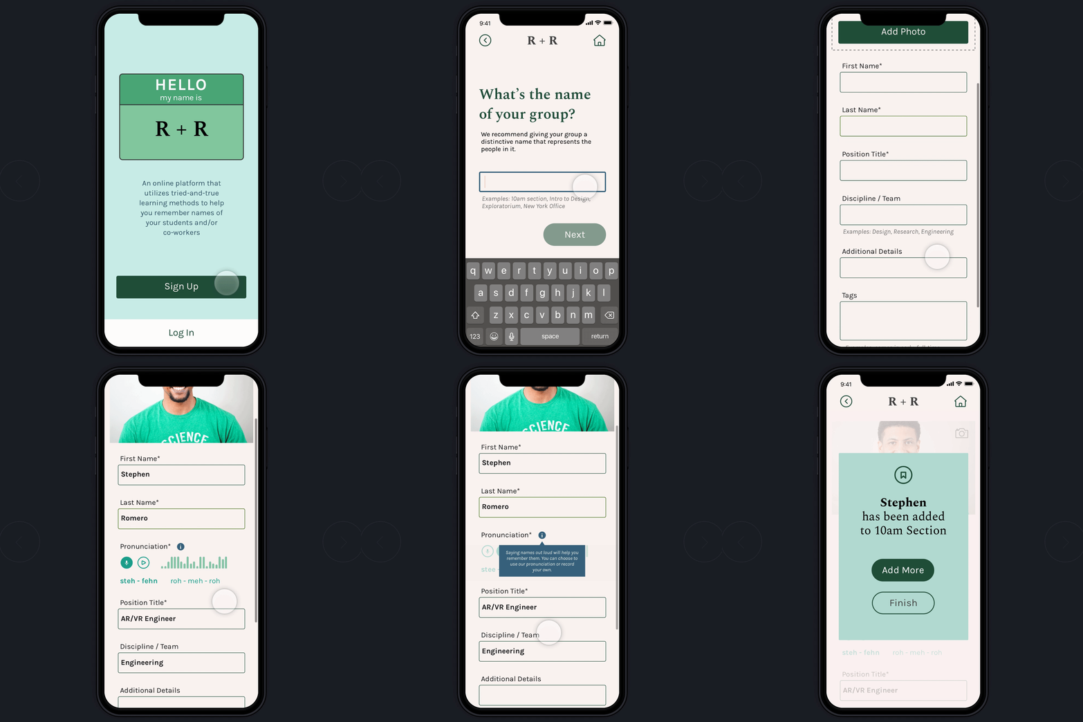
The onboarding process featured a simple signup (email and password) with in-line validation as well as a guided process that included clearer descriptions and example text for adding groups.
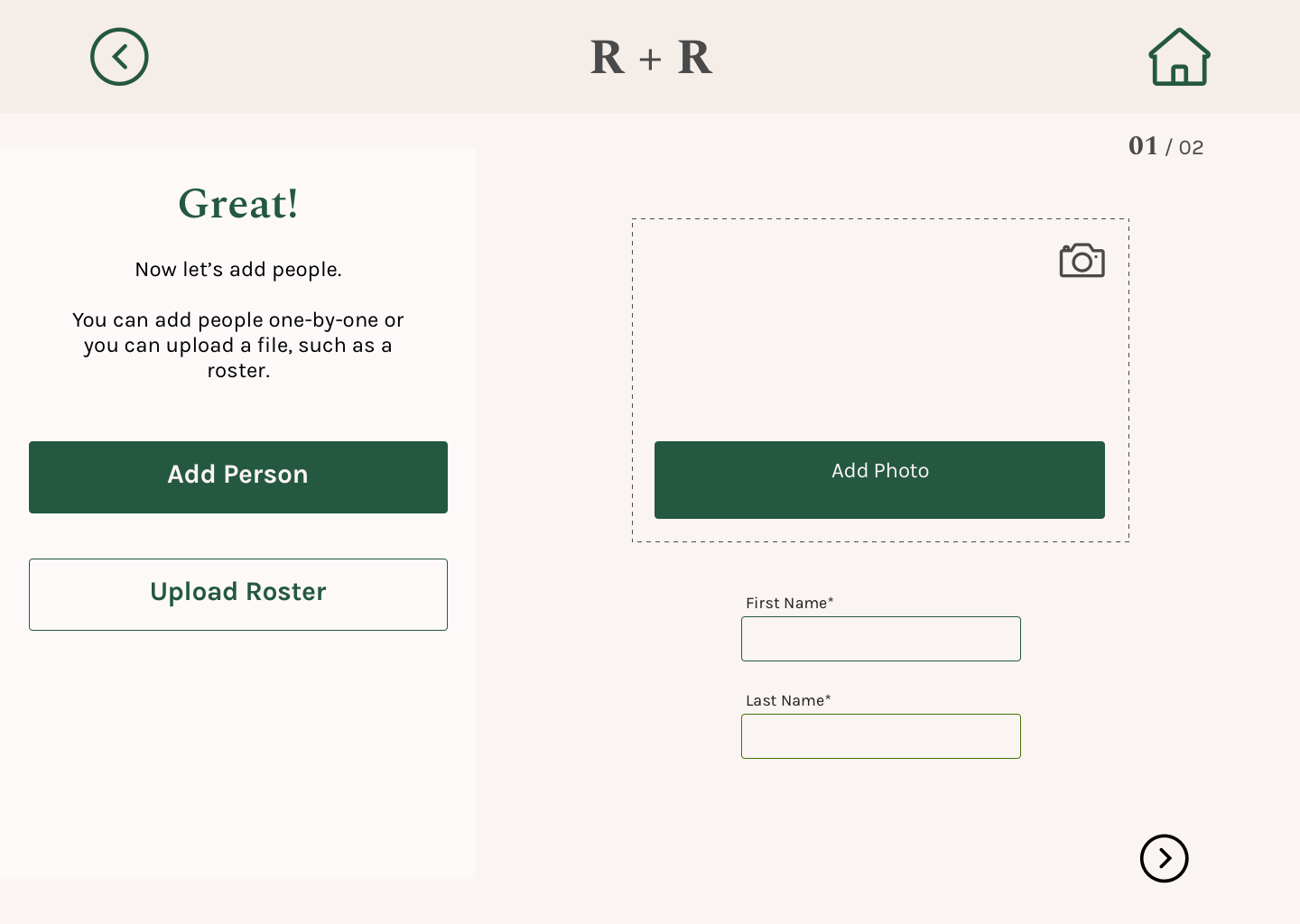
I provided two methods for adding people to groups: (1) manually, one-by-one, or (2) uploading a class roster or link to company website, with the intent of parsing the necessary data and using it to auto-fill the fields of the form. The default pronunciation would be generated upon input of first and last name, with the option for users to record their own.
Finally, several users expressed uncertainty about whether they successfully added a person, so I included a pop-up confirmation.
Dashboard
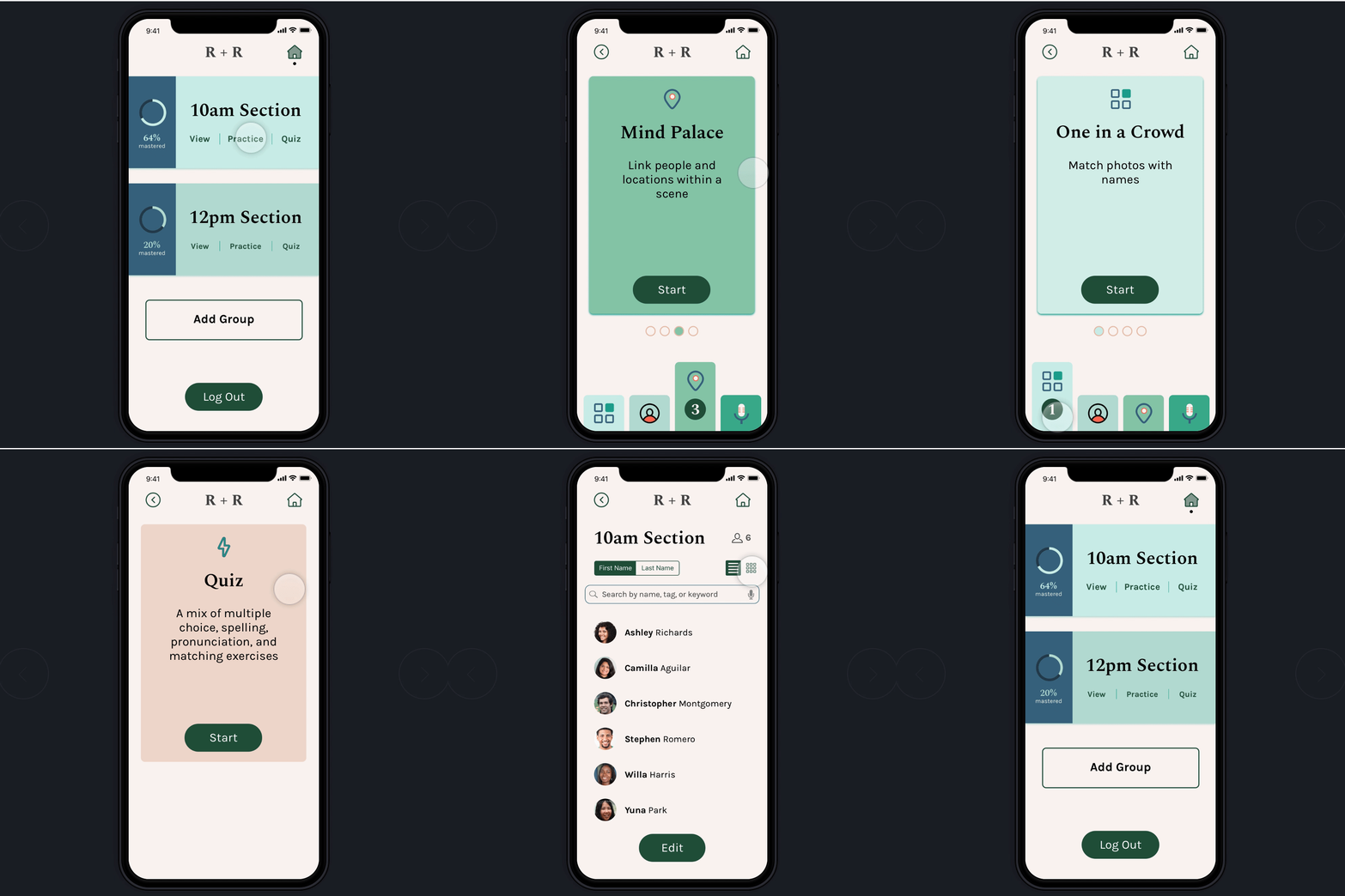
My primary objective for the group, dashboard, and activity screens was
to provide appropriate, concise, and easy-to-understand feedback so that users were instinctively aware of how to navigate through the app.
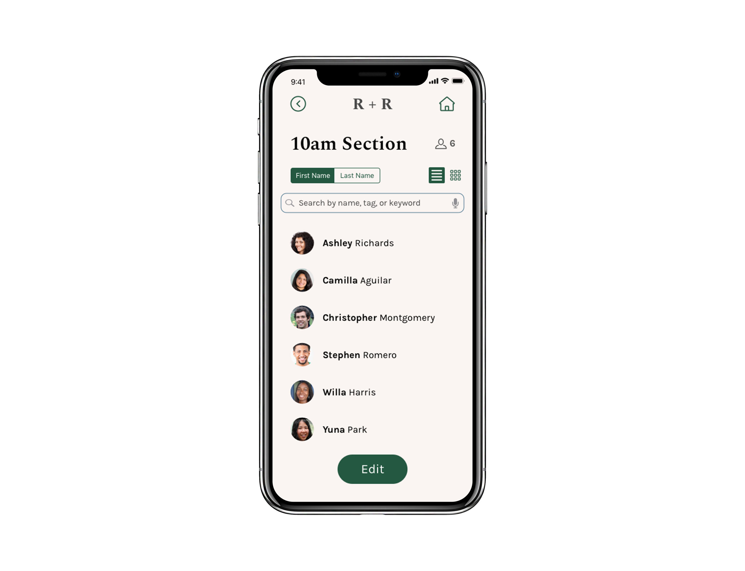
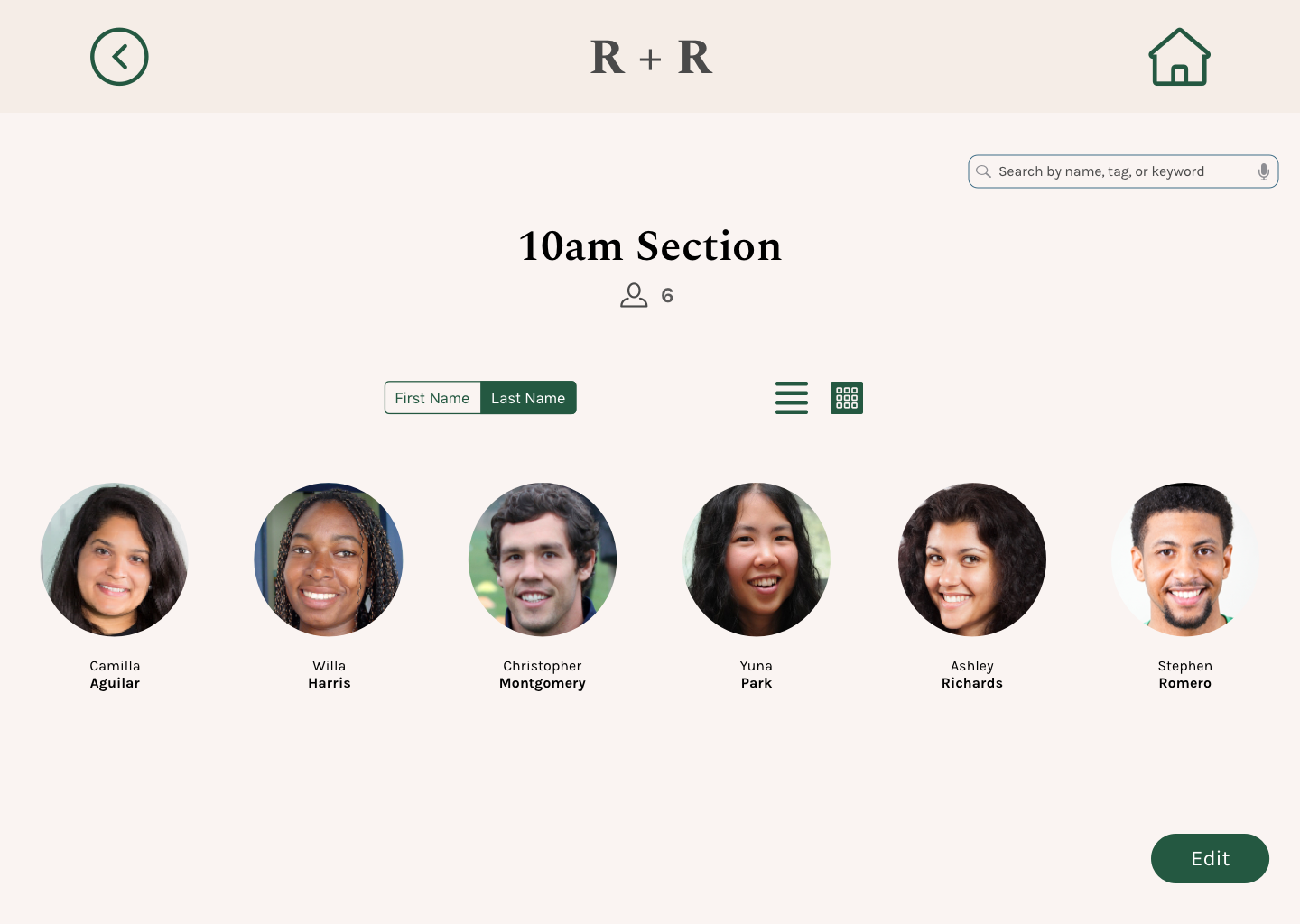
On the group page, I provided more distinctive sort and display options, and a total count of people in the group as a cue for users to check if the group has been fully added.
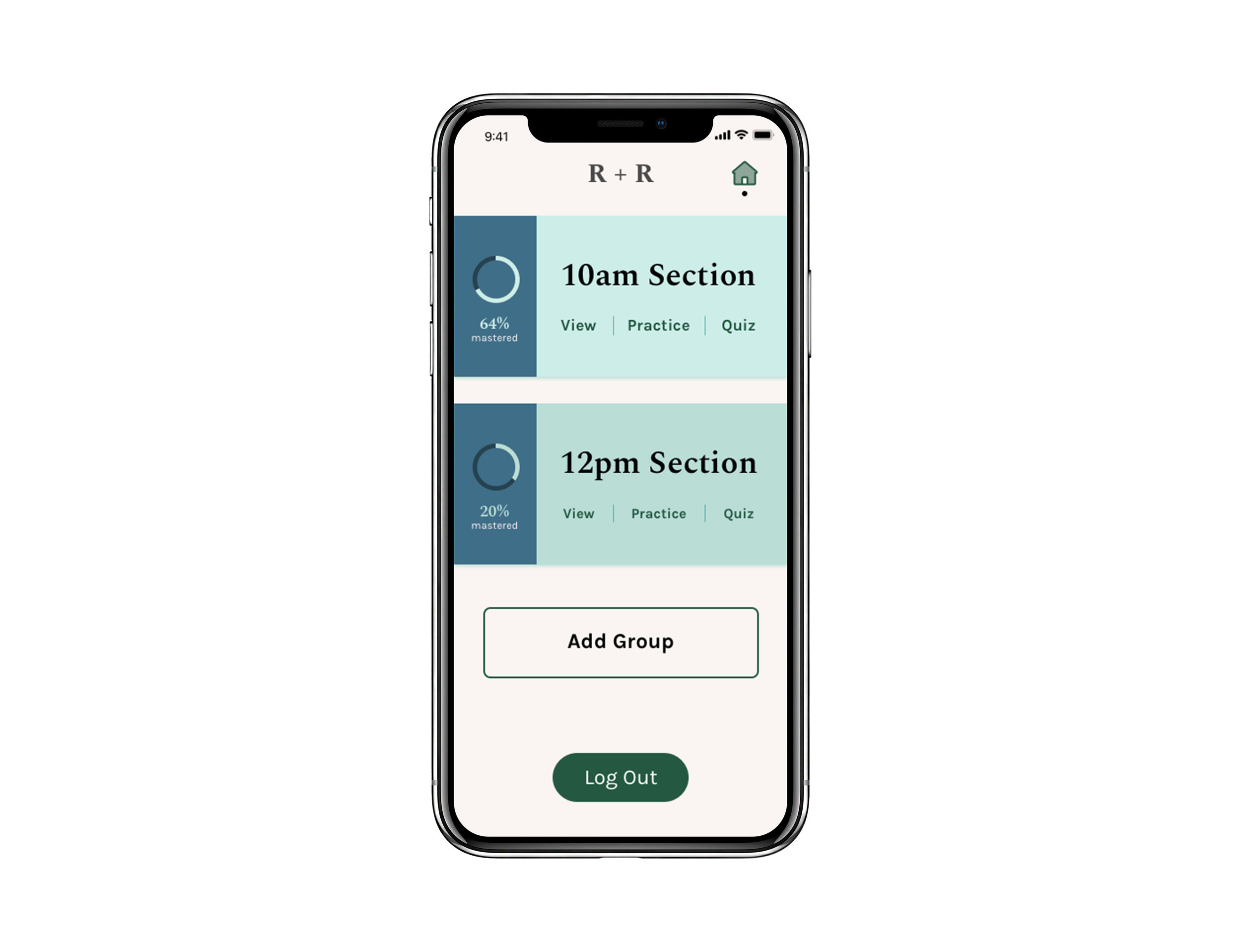
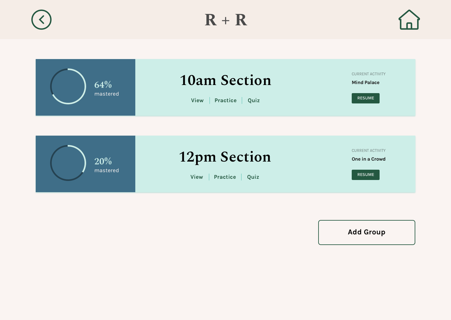
The dashboard includes three main actions — view, practice, and quiz — per group, as well as a graph to indicate process.
Finally, the practice activities are featured one-by-one, and are displayed either by swiping or selecting the buttons at the bottom of the screen. A visual indication is displayed under each card to inform the user they can swipe left or right.
NOTE: THE LEARNING PROCESS IS COMPRISED OF THREE STAGES — ENCODING > STORING > RETRIEVING

Activity 1: “One in a Crowd”
ENCODING / RECOGNITION
Each activity features a cover page followed by an in-depth look at the science behind the activity and ability to set a timer.
This activity focuses on encoding familiar faces through recognition. The user is presented with four photos and asked to choose one. I originally thought that once a user make a selection, they would automatically see if they got it right or wrong, but instead opted to include a “Check” button to prevent errors (such as accidentally choosing a photo) and to increase user control. Once the user submits their answer, they can see the results — if they got it wrong, they will not only see the correct answer, but also the name of the person they chose.

Activity 2: “It’s All in the Details”
ENCODING / associations
Each activity features a cover page followed by an in-depth look at the science behind the activity and ability to set a timer.
This activity focuses on encoding names through associations. The user is asked to match three pairs of names and details. After each attempt, the user is presented with a photo of the person they chose to further reinforce the connection between names, faces, and details.

Activity 3: “Mind Palace”
STORING / METHOD OF LOCI
Each activity features a cover page followed by an in-depth look at the science behind the activity and ability to set a timer.
This activity focuses on storing names and faces through the method of loci — users are asked to observe a location and then place people back in their spaces within the scene. Traditionally this method leverages the familiarity of certain places to store pieces of information. So for this activity, I had 2 options: (1) utilize common places that most people would be familiar with, such as a classroom, lecture hall, or company party or (2) create a fictitious, fantastical location that is distinctive and therefore easier to remember. I chose the first route, and used a lecture setup, which many users were familiar with. However, I am curious to try the second option to see if it is more effective.

Activity 4: “Say My Name”
RETRIEVING / recitation & rehearsal
Each activity features a cover page followed by an in-depth look at the science behind the activity and ability to set a timer.
This activity focuses on active learning — spelling and pronouncing names — to strengthen the neural pattern between names and faces. Users can choose to receive a hint (a detail about the person) if they are unable to answer the question. For the pronunciation, if the user answers incorrectly, they can compare their response to the correct response.
“Excellent grounding in both user needs and the science of recognition and recall.
This is a really impressive and effective product.
It feels like a complete application.”
Desktop
In addition to 60+ mobile screens that showcased various states — default, active, error, and complete — I designed desktop screens for the onboarding process. From the research, I learned that users primarily anticipated using this app on their mobile devices because they would likely be learning on-the-go. However, they saw a value in having a desktop version to upload and manage groups.
And in case you are wondering what my roommate, who inspired this project, had to say after seeing the final design:
“This is such a good idea. It is fun to use and
would be so helpful — are you going to actually build it?
Because I could definitely use it for my classes next semester.”
Reflection
Overall, this project was incredibly fulfilling because it combined two of my biggest passions: design and education, which is what attracted me to an internship at the Exploratorium (a hands-on science museum in San Francisco) in January. Through this project, I not only was able to deeply understand the science behind remembering names, but also translate those learnings into several interactive activities. Moving forward, I am curious to evaluate the concept of this app with people with larger groups (60+), explore the need and expectations for a desktop version, test responsiveness of the design against various screen sizes, increase functionality of the prototype (e.g., default pronunciation) and validate the efficacy of the various activities.
Here are some things I learned along the way:
It is not as obvious as you think. On mobile screens especially, I tend towards icons to preserve precious space. However, most icons are not universally understood, and sometimes a text label is a better option for the sake of self-evident calls to action and a more seamless first time user experience.
Writing is critical. One of the most challenging parts of this project was writing the prompts and descriptions for various features and tasks, because it required a delicate balance of clarity and brevity. In my second round of testing, I found that most people were stuck because of the writing more than the visual design, which revealed how crucial good writing is to the success of the product.
